


The Friday Face-Off is a meme originally created by Books by Proxy and now hosted over at Lynn’s Books. The idea is to compare the different covers of a book with each week being a certain theme.
This week’s Friday Face-Off theme is a cover that features a striking font. This week I’ve gone with F. Scott Fitzgerald’s classic The Great Gatsby.
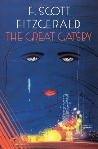
Cover A 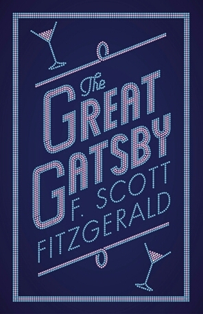
Cover B 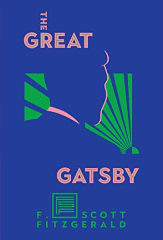
Cover C 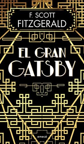
Cover D 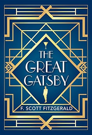
Cover E 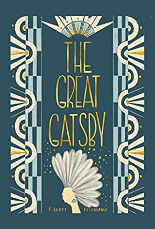
Cover F 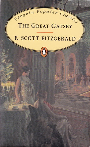
Cover G 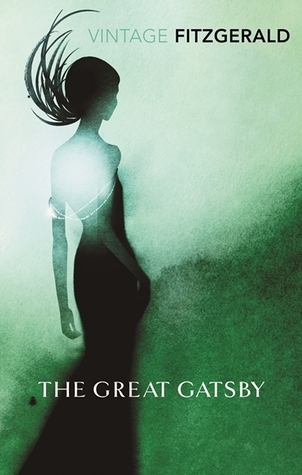
Cover H
And the winner is… COVER E!
This one screams of the Art Deco era. The font, the design work and the colours. It works on all levels for me.
What are your thoughts? Do you agree with my winner, or does one of the others work better for you? Let me know in the comments!
Next week’s theme is a cover featuring mist or fog: “A thin grey fog hung over the city, and the streets were very cold; for summer was in England.”

Same here, cover E, really stands out
LikeLiked by 1 person
I never understood Cover A. There’s something I like about Cover G — it connotes “timeless classic.” But, yes, Cover E draws you in like a funnel.
LikeLiked by 1 person
F for me… (Much nicer than the cover of mine which has like… no graphics at all)
LikeLike
It’s the cover G for me, I can see “the era” right there. I’m old fashioned and I like the smell of a real bookstore. There’s something very endearing in the process of choosing the right book in the store. Wouldn’t change it for online stores ever, but this year, during the corona time, found some interesting books on https://bit.ly/2SvJw4w Maybe it’ll help someone else too.
LikeLiked by 1 person